
What's more hands-on than renovating a home?
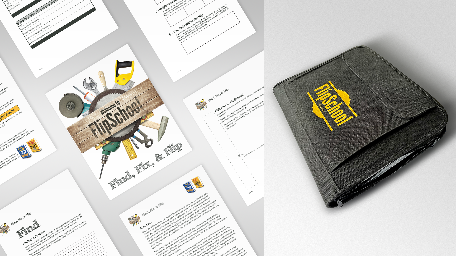
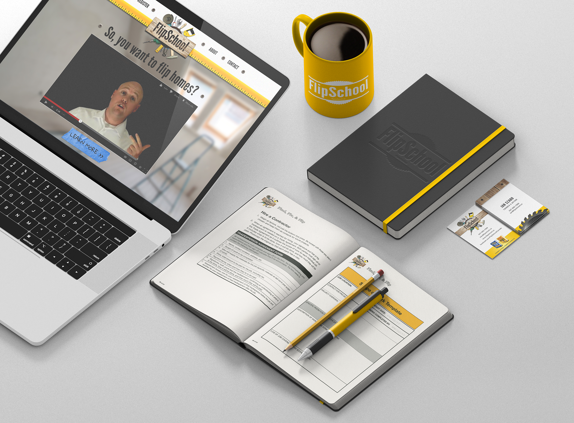
For Flipschool, the brand needed to have a handyman's feel to it - so the brand ID included wood textures, painter's tape, screwheads, pencils and notebooks, and lots of measuring-tape-power-tool yellow.
Business cards were heavy duty, the contractor's binder was sourced specifically for it's durability, and every email/post/message shared by the company was written to sound like Ian, the founder - ZERO jargon, all straight talk, all real.
Role: Brand strategist, Creative Director, copywriter, designer, photographer

STUDENT STUFF
Designing long-form content like study guides and teaching material required a lot of back-and-forth discussions and sessions with the client.
Fortunately, the client was super flexible and open to seeing new opportunities in how we could lay things out.
The physical workbooks, the in-class materials, the contractor-grade binder/folio - everything had to feel like it could survive being tossed around in a work truck and on the job site.